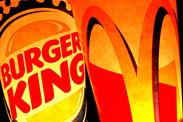
I don't like to comment on my lower scores because I am not a professional, but I think this image is just to orange. If more of the white was a crisp white, I think it would've made for a better photo.
Great composition, lighting & colors. I like it as it is, don't see how it could be improved. The grainy look in the whites and yellows makes it look classic.
I wonder how you lit the cans up, from the inside?
Hardly opposites IMO in fact I would say same sh... er crap, different pile.
Only a five from me I feel it misses the challenge theme somewhat even though the are "opposition" but that does not make them opposite.
Yes it is, but not really opposites per say, more like opposition. Slight difference. I like the way you lighted the cups from within but the harshness is a bit much for my taste. Also the set up leaves me wanting, the black line on the right is distracting and the cropping seems a bit tight. A 3
Hope you don't get DQ'd for photographing artwork...I won't tell! I don't think they are opposites because they are direct competitors for the same market demographics...all of us who eat! :o)







 Add photograph to your favorites
 Add photographer to your favorites


 Photographer found comment helpful.


