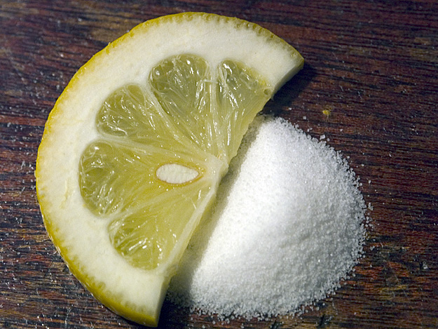
The grain in the table makes a nice contrast to the texture of the lemon and the sugar(?? looks like it could be salt). The stray granules take away from the subject.
I love the crisp focus and textures on the lemon slice and shadow on the pile of sugar. I wish the background was more bland but I appreciate the centered composition.
Wrong background IMO for this style of shot. Sugar grains all over speak of lack of attention to detail.
Well foused
Centered composition was your only option here given the background .
With a bit more time and thought into this I bet you would have had a high scoring shot.
As it stands now ... A 5 from me
Good idea - and nice execution of the macro. Planned or not, the seed in the lemon adds a great visual touch. Perhaps it would be a bit better with a non-competing background, but that's a very minor point. Nice job.
Would have been much better with a different background. You might consider an inexpensive light box (you can get them in craft stores for about $15) for shots like this. Another option would be some good colored paper. The composition is quite nice and the lighting is not bad. A little lower and you would have shown a little more form to the mound of sugar.
I had this idea as well, and didn't do it, for the same reason that your picture runs into problems -- how does one make white grains of sugar interesting? The table top background is not helping, and the composition of the lemon and sugar isn't particularly engaging. Yes, the picture meets the challenge but aside from that, there's not much going on here to reward the eye.
Good - sweet vs. sour does convey an "opposite." The wood-grained background is a bit noisy - but the dark tone certainly allows the light-colored lemon and sugar (figure) to stand out.
great creative idea. the yellow provides a very nice splash of color. good detail. you've layed it out nicely. only improvement i can see (and it's kind of nitpicky, but sometimes the littlest detail can be the difference between good and great) is if you had found a lemon slice with no seed in it. I think this is still one of my favorites though. good work.
Nice idea but the shot just looks like a disposable camera snapshot surely some more thought could go into the presentation of the idea? Would you hang this on your wall as a piece of photography?
I tried one like this but threw out my results because I couldn't get the focus good... your is better than mine was but still looks a little soft! Nice job though...
Good idea and nicely arranged, but I have to say the wood background is very distracting. Perhaps if you had done this on a plain white plate it might of been more appealing. 6
Without that title I could swear this could be waiting for a shot of tequila...
Thins seem a little shiny on the left side of the image and a little more focused on the right side of the image. Other then that, I like the interpretation of the challenge.
Technical: Focus, Exposure, Lighting, 9
Appeal: does it caught your attention, Motivating, Etc.? 6
How well does it meet the challenge: 10
Total Averaged Rating
Perhaps a different surface texture and lighting to bring out the color of the fruit would make this a little more appealing. As is, it fits the theme but isn't as interesting to look at as it might be if staged a little differently.





 Add photograph to your favorites
 Add photographer to your favorites


 Photographer found comment helpful.


