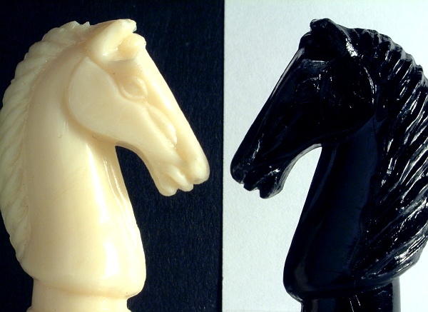
Overall, I love this piece! My only criticisms, and I should mention that they are VERY minor ones, are that I would have prefered to see the same texture in the white background as I see in the black, and you may have been better served by shifting the image to a true B&W to eliviate the tonal differences between the "white" knight and the "white" background" -- I do find each of those just the slightest bit distracting.
A very nicely executed shot. The contrast and detail on the black horse is lost a little - setting the background further away might help to make the background disappear more. The black knight is cropped a little short on the right side.
Nice idea! I like this better than the other yin-yang ones I've seen so far. But I wish you had pulled off full symmetry here, and maybe true color symmetry as well.







 Add photograph to your favorites
 Add photographer to your favorites


 Photographer found comment helpful.


