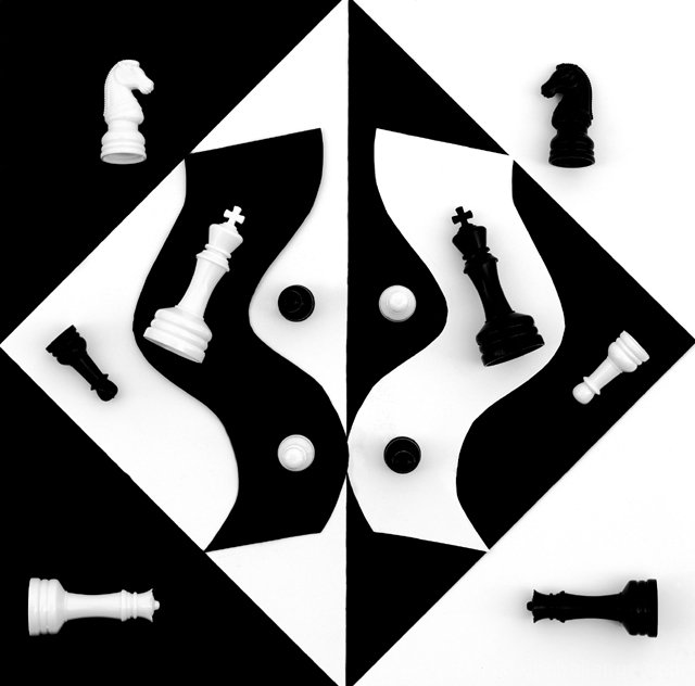
Even though the cropping isn't perfect and that shadow under the black knight is a bit distracting, this picture is one of my favorites of this competition. You did a really great job with such an elaborate setup. Nice shot!
Wow, you really put some time into setting this up. I actually makes my eyes hurt a little to look at it for very long. You took some real time to cut out the black and white curves and while everything else is perfectly lined up, those two peices seem off because they aren't touching all the edges of the opposite color and on the bottom curve they are overlapping. I had to look at this in spurts, it really hurts my eyes, not sure why. I would say more contrast but that would make it hurt even more. I like the idea, maybe different lighting would help? The black is great but the white seems rather dull. A 3
I can visualize this wonderful image on a cover of a chess magazine! :-) Any more contrast and it'd fool people into thinking that this was a graphic illustration instead of a photograph. Very cool! I like how the black curve overlaps the white curve. That caught my eye and added some 'flavor' to the picture. Both curves could've been just a wee bit smoother and more exaggerated, but that's just me. Kudos!
Technical: Focus, Exposure, Lighting,
Appeal: does it caught your attention, Motivating, Etc.?
How well does it meet the challenge:
Total Averaged Rating 10
Beautiful, interesting, and just plain neat! The corpping on the top and bottom are too tight. I'd like those areas to come to a point as well. The center curvers don't meet perfectly, but I'm just nit picking now...9.
Nice effort (I assume it involved quite some work). Would have wanted detail in the black chess pieces as in the white ones, but I can understand how that was really hard to accomplish. One of the best challenge interpretations so far. Nice with an image not involving fire and ice :-)





 Add photograph to your favorites
 Add photographer to your favorites


 Photographer found comment helpful.


