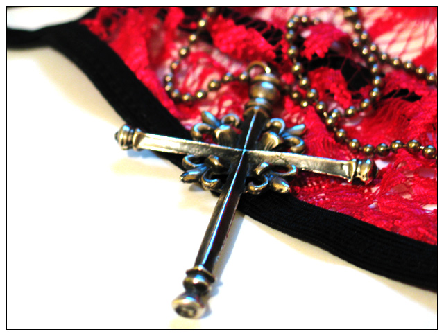
Once again I'm taking a risk and will probably pay for it, what else is new? :) I had many different ideas for this challenge, but was too busy to work on any of them until today, the 11th, and this is the photo that I am most pleased with, although the more obvious opposites shot that I took would probably do better in scoring. Still, this is my favourite - it represents the opposites influences that we face every day in the modern world, and the forces working for and against us. I'm expecting a lot of "does not meet the challenge" again, but hopefully one or two people will get it.
I took this handheld (which was kind of hard for this, I'm not a very steady person - lol), using the computer monitor to give off some nice blue highlighting for a little of a fire and ice effect. The intense lighting is intentional. I took several nice, softer lit ones and just didn't like them as much for the topic. Opposites demand drama :)
Editing: Resizing, levels, border.
Statistics
Place: 229 out of 286 Avg (all users): 4.3153 Avg (commenters): 4.5833 Avg (participants): 4.0992 Avg (non-participants): 4.4655 Views since voting: 1296 Votes: 295 Comments: 14 Favorites: 0
overall this could have been a sucesfull photo except for over blurred cross, the depth of field seems to be very low as most of the shot is blurred and out of focus, different parts of the shot are in focus and some are not which isnt too appealing to the eye, cant quite see much relation to the topic although i maybe not seeing what you do, keep it going though.
A good concept ... shallow DOF doesn't work that much here though. Perhaps it might look better (to me) if the DOF were wider. Compositionally, the diagonals work well but the white space on the left is a little bit bigger for my taste - I do like negative space but has it has no purpose here. But that is just my opinion, you can disregard it.
It took me three looks at this shot to figure out the opposite parts. The lingerie is not very well defined. At first I thought it was just a lacy hankerchief or doily. I thought the opposite was the Catholic church thing, you can sin, confess and all is well. Anyway, the DOF of this shot doesn't work for me personally, I would like to see more the the opposite side of the cross and see more focus overall. The white is almost blown out also. A 3
Interesting composition, and it's nice that the background doesn't compete with the subject(s). the problem is that the subject is not in focus. the shadow from the cloth in upper left is also distracting.
The "sinner" side took a little thought for me. A little sharper would be nice. All in all, I like it though. nice composition and exposure. colors are nice. 6.







 Add photograph to your favorites
 Add photographer to your favorites


 Photographer found comment helpful.


