Took about 50 of them till I liked anything.
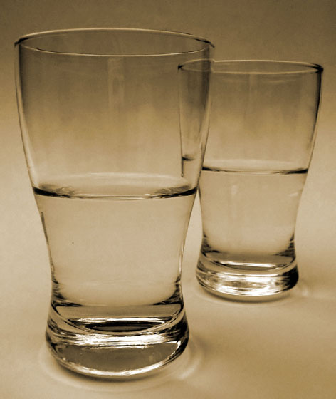
The thing that bothers me the most is the camera reflection in the glass (too bad it's basic editing or it would be gone in a sec).
cropped, NeatImaged and Hued.
Statistics
Place: 143 out of 286 Avg (all users): 4.9371 Avg (commenters): 6.2941 Avg (participants): 4.8106 Avg (non-participants): 5.0353 Views since voting: 959 Votes: 302 Comments: 17 Favorites: 0
Nicely set up - the difference in the levels because of the perspective is really well done. The decolorizing of the photo is great and appropriate for the composition.
Love this, How brilliant that you can submit a photo of two identical things in an opposites challenge and hit the nail squarely on the head...my hat off to you sir...brilliant again, have a big fat 10
Many other images with the same concept, and some better executed than this.
The sepia tone makes it feel dull and uninspiring, and the dark tones at the top don't help this.





 Add photograph to your favorites
 Add photographer to your favorites


