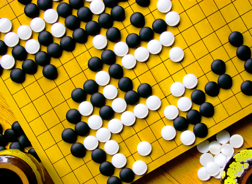
Black vs. white. Classic, simple and so real. This is a good idea but the distractions of the table, cup and sides of the boards really take away from this shot for me. Also the focus seems just a tad soft overall. Maybe if you filled the shot with just the board and rotated it just a bit so the lines ran from corner to corner? Also the board seems rather dull, not sure why. A 4 as is
Great clarity and detail. Black & white contrast well (obviously). But, what I really like is how your board and the underlying wood table share the same yellow hue - which allows both to coexist in the background. Nice work.
Otherwise known as Othello? Aren;t the peices supposed to go in the squares rather than on the junction of the crossing lines? Otherwise this is a nice shot,. - 7
Excellent technique; almost a graphic quality. I almost passed by this one with a medium socre and then upped it. It brought me back! Hope you tell some of the techniques used for those of us trying to learn!
This is a beautiful shot! Very well lit, and lovely composition. Love the subject matter -- any fan of Go is all right by me! This is the first ten I've given in this challenge. I predict a ribbon!







 Add photograph to your favorites
 Add photographer to your favorites


 Photographer found comment helpful.


