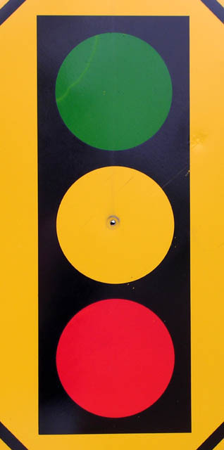
Great simplicity - I like the imperfection in the center of the sign but the diagonals at the corners bother me a bit. The colors are great and the choice for the challenge is really refreshing.
Great idea! Centered composition is appropriate. Straightforward point of view is, well, straightforward and communicates what you want to communicate. Have you tried other angles for fun?
It is not a photo that can hold a viewer's interest. It would have been much better if you had included the surroundings of that sign, or the sky, or just anything, because right now it looks pretty much like a picture one can draw using Microsoft Paint. Anyway, I wish you more luck in the challenges to come.
Composition: Subject Placement, Cropping, Background 5
Technical: Focus, Exposure, Lighting, Processing 7
Appeal: Is it Interesting, Motivating, Etc.? 5
How well does it meet the challenge, original idea: 6
Total Averaged Rating 7.00 Dick







 Add photograph to your favorites
 Add photographer to your favorites


 Photographer found comment helpful.
