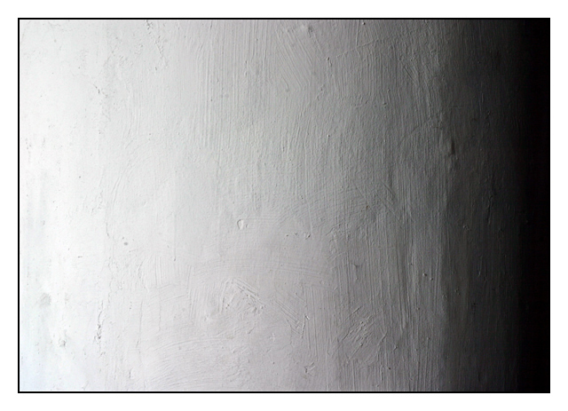
I think you would have had a stronger image if you could have had more texture on the column. The gradual transistion from white to black is a more unique idea than most however.
You've captured the texture but otherwise there's not much visual interest here. I suppose it meets the challenge (light vs. dark) but I think that's a stretch. The picture, without the title, doesn't call out OPPOSITES to me.
I like the simplicity of this very much. I appreciate the texture of the surface, it gives the piece more visual interest. I'd like to see the white on the left a bit more white - the way you've put the border on, it's more obvious that it's not pure white.
Would have been great for abstract last week! As for opposites, I guess you are going with dark and light? I wish you could bring out the texture of the column a bit more.





 Add photograph to your favorites
 Add photographer to your favorites


