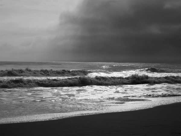
This is a good image, but I do have a little constructive criticism. The horizon is slanted down to the right a bit, and it's right smack in the center, dividing the plane into two halves in a way that isn't really working all that well (IMO). There is a lack of contrast as well, both tonally as well as compositionally. Nothing really grabs my eye and leads me through the picture, you know? It's a little flat.
Keep shooting!
_Nathanael |







 Add photograph to your favorites
 Add photographer to your favorites


 Photographer found comment helpful.


