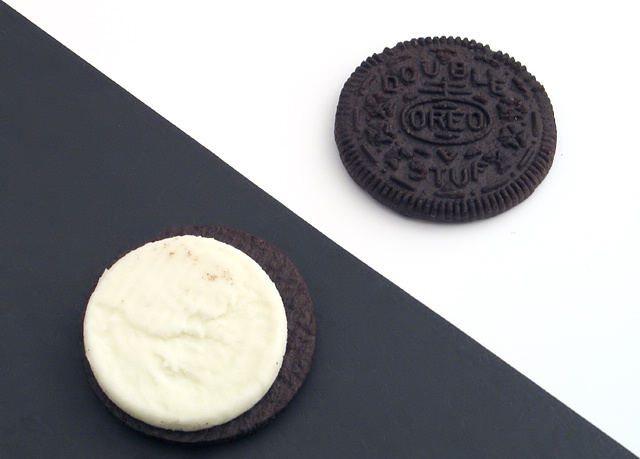
Me cookie monster. Great job! It may be better if the white on the bottom cookie didn't have the yellowish cast to it - but that's a minor point. Nice idea and execution.
I think this image would be better without the opposing colors in the backdrop. Just a clean image of the two oreo halves. The cookie seems a bit grey vs. black. Not sure how to improve that, but something to think about.
This is simple and creative. The geometrics work well. I think in black and white it would remove the difference in color between the black and the brown of the cookie. 5






 Add photograph to your favorites
 Add photographer to your favorites


 Photographer found comment helpful.


