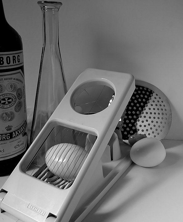
No nice rocky landscapes for me, so just a terrible remake of his nice still life. Great how he managed all the reflections.
Tried to get the angle and the light right, but I was running out of time (and couldn't get any white eggs).
[Jan. 21st, 2009 10:48:26 AM]
Ai! Misspelled the title :( Next time I have to make more time.
Here's Ansel Adam's original one
Statistics
Place: 193 out of 219 Avg (all users): 4.6017 Avg (commenters): 5.2500 Avg (participants): 4.2025 Avg (non-participants): 4.8092 Views since voting: 1405 Views during voting: 377 Votes: 231 Comments: 15 Favorites: 1 (view)
I saw this entry and hoped it would do well. I am sorry it was not a successful score but the image is very good. The tones came out really well in black and white.
One time I misspelled a Title and sent a Ticket to the Site Council and they fixed it for me. Just in case there is a next time.
Such a pitty so many voters gave you 1's and 2's etc, I wonder if more out of lack of knowledge with all of AA'S work. You took a chance on an obscure image of his and produced an image with clarity, more than I can say about some that landed in the 6's. Bravo to you. This IMO should have scored higher.
Not really sure how this is representative of Adams apart from the fact it's B&W, however since I'm not familiar with his entire work I'll let that go. That aside, this really just feels like you've taken a snapshot in the kitchen and converted it to B&W.
The main subject isn't particularly appealing, and the other objects tend to just clutter rather than add anything.
While I give you credit for replicating his still life image, the challenge called for a photo "in the style of Ansel". I cannot think very highly of a "copycat" image, when there were so many other options for the challenge. Maybe if you had adjusted the darkness/contrast, the image would be a bit more powerful.
I was almost thinking that this DNMC as I was baffled as to why this was in the style of Ansel Admas. Then I googled "Ansel Adams Still Life" and found what I initially thought was an identical image which would lead to a DQ for you. Then I finally twigged that this was very much a recreation of an Ansel Adams original, and to that end, I think you've done a great job. Completely different to every other submission in the challenge.
A bit more of a contrasty image would work better I think though...
Hah! Bravery points awarded here. You HAVE studied your Ansel, haven't you? Execution falls a little short, unfortunately, most noticeably in the light dropoff front to back on the egg cutter; my eye is drawn inexorably to the bottom left and out of the image by the flow of light, and that's very un-Adams. If the lighting were a tad more even, you'd have been able to better-express the purity of the white tones: you have them mostly on Zone VI where they really want to be clustered around Zone VII... Also the cropping lower left is very arbitrary. Sharpness is excellent, DOF is very good, detail is excellent, composition (especially on the right side and lower left) is a bit lackluster. Still, a good effort and one that goes beyond the surface of Ansel's most popular imagery.
ETA: Pity about the misspelling of "Francisco" in the title :-(






 Add photograph to your favorites
 Add photographer to your favorites


 Photographer found comment helpful.


