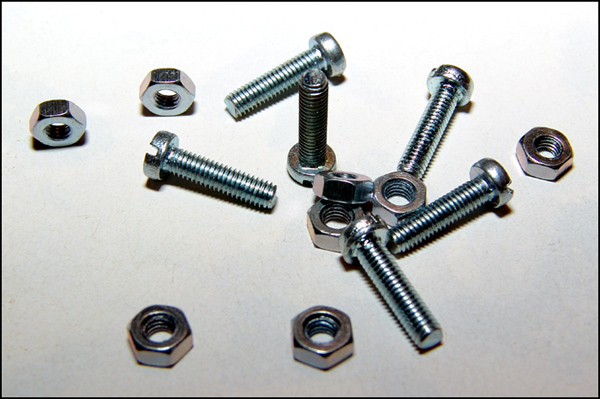
Good idea in trying for multiple opposites, but the only apparent one I see is nuts and bolts. There is some blur on the bottom of the shot, and only two more nuts than bolts (few v. many?). Light and dark might have been more emphasized with longer shadows? There is another opposite: horizontal and vertical.
I think you're trying to get too much into one photo. Simplfy the title, simplfy the composition, an odd number of nuts and and even number of bolts (perhaps 2 bolts and 3 nuts) would be sufficient to convey the challenge.
Pretty clean shot, but would maybe "pop" more with a cleaner white? I don't think of these as opposites, but I guess they could be. I like the simplicity, also, but would like a little stronger interest.
Too much title ;) It fit with the first part, nuts and bolts. The shot is okay, the lighting could be a bit more balanced and maybe a better order to the nuts and bolts. It looks like they were just tossed onto a white board and a few shots were snapped off. A 3
Your idea is okay but your composition is a little weak. Your title is also 'over kill'. Leave something for the viewer to discover on their own. You shot is being seen world wide so you should think in terms that everyone can understand without explanation. Try and keep you light even, see how it's darker in the foreground and lighter towards the rear? Good luck.
Upped my score on this one after looking at it again. You have portrayed quite a few different opposites with this one image. Very creative! Technically I see nothing wrong with it, so I had to give you a higher score.
A good idea, but would like to have seen it shot in a way I've never seen before - maybe looking head on to one of the bolts with the nuts and bolts all blurred behind. Just an idea. see www.comstock.com for ideas of composition.
A simple shot like this only works if it's technically perfect. This one left me wanting a better exposure, without blown hilites, and I wish it was either deliberately a small DOF, or everything was tack sharp (the bolts in the foreground in particular). But nice layout, and fun "opposites" concept.





 Add photograph to your favorites
 Add photographer to your favorites


 Photographer found comment helpful.


