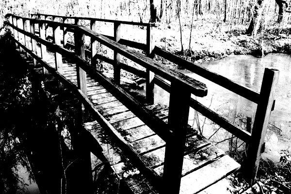
Taken At Noxubee Wildlife Refuge in Starkville MS. I am really hoping this will be my personal best.
Post Processing: Not much editing: Increased brightness in light areas and decreased brightness in dark areas. Increased contrast. In PS, crop, resize, and increased contrast again.
Statistics
Place: 207 out of 219 Avg (all users): 4.3149 Avg (commenters): 4.7000 Avg (participants): 4.1282 Avg (non-participants): 4.4076 Views since voting: 909 Views during voting: 383 Votes: 235 Comments: 22 Favorites: 0
I'm not sure how much I like the super amount of contrast -- I think I'd like to have seen it a little more natural, but the actual bridge itself and the composition to me are great. :)
I like the image, I think the editing may be a touch harsh. I like how it looks like an old photograph though. Love the title too, I've often thought about adding the "Comments Welcome" to the title! :) Best of luck!!
Your image has only four tones: black, dark gray, light gray, and white. Adams' style usually took advantage of nine to eleven tonal ranges to emphasise the textures and depth of what he saw and wished to reproduce.
Too much contrast - the whites are blown out and the blacks are solid. There's high contrast and then there's way-too-much-contrast; sadly, this is the latter. A more subtle touch next time will hopefully yield a more engaging image.
Though I find your composition fairly interesting, the photo appears to be too contrasty. The highlights are so blown out, and the shadows are so dark, there seems to be very little detail left.
I would have loved to have seen the texture of the woodgrain, or the reflections in the water.. But it's all gone. :(
Having chosen this viewpoint, I might have stepped back to give the bridge a bit more sense of place.
Also it's a bit too contrasty for me (almost posterized) but that makes it different so that's OK -
Learn from others but try and develop your own style (that's either philosophy or BS - you decide)
Good luck
This is a high contrast shot to be sure but lacks the depth of an Adams print. The wood in the background seems blown to me. I'm not sure how you processed your shot but more attention to mid tones may have helped. 5
Since you insist. This looks like a really old photo. Strong contrast. The trees are kind of washed out in the background. Since this is advanced editing you could have tried darkening the background and lightening under the bridge.





 Add photograph to your favorites
 Add photographer to your favorites


 Photographer found comment helpful.


