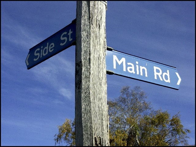
Good colors - nice lighting and a perfect sign showing opposites. I was going to say you needed more light on "side street" but finally concluded that is was a nice irony that the side street is shadowed. Composition seems a bit centered - and just wonder what would it look like if it was shot with the sign pole being a little diagonal instead of straight vertical.
Very funny and a nice idea for this challenge! I like that the light falls brightly on the "Main Rd" sign and dimly on the "Side St." The angle is interesting--just showing tree and sky in the background really focuses attention on the subject. There is a little pixelation on the signs and the tree -- probably just an artifact of compression to meet the challenge requirements. Overall, very nice.
Technical: Focus, Exposure, Lighting, 9
Appeal: does it caught your attention, Motivating, Etc.? 9
How well does it meet the challenge: 10
Total Averaged Rating
I like this picture a lot, and it fits the challenge very well. But it is severely oversharpened. I'd want to give this an 8 or 9, but the oversharpening drops it a few points.







 Add photograph to your favorites
 Add photographer to your favorites


 Photographer found comment helpful.


