I'm genuinely shocked and quite gutted that this didn't score higher.
DPC can be weird at times.
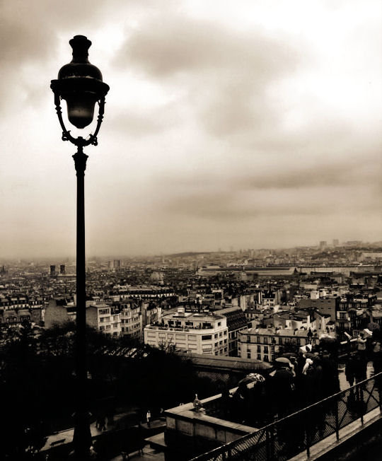
Literally every person I have ever shown this picture in real life has said it was amazing. I even have a print on canvas in my living room.... and people who visit, love it.
I'm not being egotistical or arrogant when I say that I really do think it deserved more and I do not understand DPC at times.
I appreciate the post-challenge comments, but saying that it's quite an uninteresting photo? Nah. I don't agree. But then I wouldn't would I?
It's interesting and beautiful to me.
Thanks for reading :)
And thanks to all my commenters and voters.
Statistics
Place: 355 out of 531 Avg (all users): 5.3871 Avg (commenters): 6.1111 Avg (participants): 5.3711 Avg (non-participants): 5.4310 Views since voting: 2334 Views during voting: 342 Votes: 217 Comments: 13 Favorites: 2 (view)
Read through your comments, clearly the mood was well presented via the subject and your toning. I agree that the image is very interesting and intriguing, and I scored it a 7 because I love the mood, but the composition is potentially holding it back from a broader appeal. I agree that the horizon is splitting the photograph in half giving the image a slightly static feeling, and then it's tilted, which may be a function of the cloud layer. However, for me it works, and I love the feeling of the clouds creeping in over the horizon. The bright whites in the top right corner probably could be burned down, as it attracts the eye immediately dragging the viewer out of the frame. We may not think of this immediately, but I do believe that it limits the viewers enjoyment whether they no it or not. Finally the PP is a bit obvious in that I can see a trail from the layer mask over the lamppost. If I noticed trail over the lamp during voting I would have scored it lower, probably a 5. Obviously, we are nit picking, but also offering reasons why it may have score at 5.4. I will leave you this...I still like it despite "seeing" things I did not readily see during voting! The mood grabbed me and kept me.
Didn't vote on this one, but I would have given a 3 or a 4 (I am leaning towards the low scores in this challenge). The reason is that <<>> the subject matter is uninteresting, exposure and composition not great and the toning and mood a little bit depressing.
Composition: It is not so great to divide an image exactly in half with the horizon. If the lantern is the subject, I want to see its foot. If the people are the subject, they are not very visible and put away in a corner. If the city is the subject, landscape would work better.
Exposure: Sky to bright vs a too dark foreground. Fill flash, shadow/highlight to get details out of the shadows or layer multiple exposures to bring it out more.
Overall it is simply not so interesting.
its definitely a cool shot and your processing gives it a distinct mood, but other than that the picture is not extremely original or grabbing... not much for the eye to hold onto, I think that's why your score was a tad low, though i did give it a 7






 Add photograph to your favorites
 Add photographer to your favorites

 Photographer found comment helpful.


