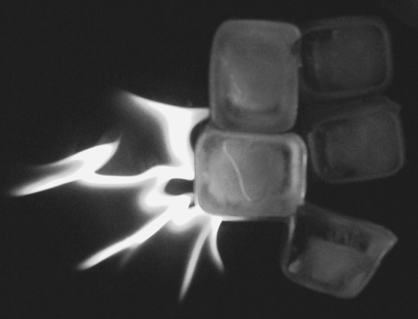
Fire and Ice is tough to pull off. Here's what I think falls short in this image: contrast, using ice cubes, and going in black and white (which seems like a waste of color for this kind of image!). The "flame" is a bit odd, and there's no visual explanation for that. The composition doesn't treat the eye, IMHO.
The ice looks out of focus and is awfully dark. It doesn't stand out from the background at all. The fire is interesting and by itself might make a good photo, but this combination is pretty dull.
Neat Idea, but needs to be infocus. Also should be in color so you can see the different shades of the fire as well as the clear ice, and the picutre is very flat try bumping up your contrast!!!
This is a cliche, but I like it. How you captured the flames is very good. I only wish this was less blurry, is in color, and has more contrast. Nice attempt!







 Add photograph to your favorites
 Add photographer to your favorites


 Photographer found comment helpful.


