A social commentary that might fit well in an editorial spread. Walking on the fringes of the challenge description though but I'll give you a 6 for stretching our brains a bit. Good luck!
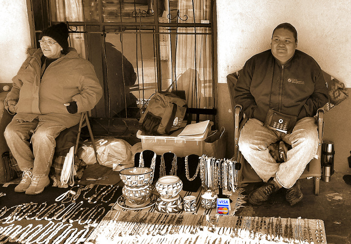
Accepted everywhere, right? The spot of bright logo in the middle of a sepia shot doesn't usually work for me. It doesn't here either, I'm afraid, but I do recognize how you needed to draw attention to those logos.
Great use of your tone and bringing out the credit logos. A little hard to catch, but as soon as you see them, it becomes SO obvious SO fast what this image is. I keep wanting to see it from a different perspective, but a great shot none the less!!
I understand the selective desat. In fact, I wouldn't have noticed the Visa/MC sign without it. But the comp itself is rather unbalanced. It seems slightly out of focus, and even though the eye is drawn to the Visa/MC sign, I am still not sure where the focal point of the image lies. This is all convention, and I'm sure many people will adore this image more than I do as a matter of taste. I hope this helps.







 Add photograph to your favorites
 Add photographer to your favorites


