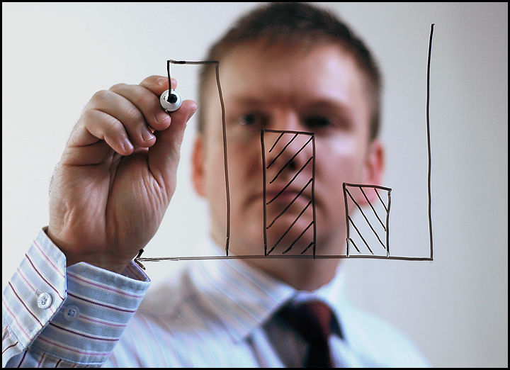
I got this idea from a photo on Shutterstock... I guess imitation is the most sincere form of flattery...
[Jan. 20th, 2009 12:26:45 PM] To some of those who commented:
-TonyT: you're right - that brochure photo looks a lot like this one. But interestingly, that's not the one that inspired my idea. Mine was by a photographer named Helder Almeida on Shutterstock, whose photo also uses an organogram like the one you found. I feel somewhat guilty that my idea was not original, but the challenge for me was just getting the execution right (I learnt a lot about working with studio lighting and glass from this shoot).
As for comments on the chart: I didn't want it to be too neat or perfect, because then it wouldn't look like it was hand-drawn in a meeting, and I left it without much detail so that it retains a generic quality so that it works better as a stock image.
************
Wow! I was really pleased when I saw this one was headed for a PB, but I didn't think it would place so high. I'm chuffed with my first ribbon. Thanks for all the votes and especially the comments. And well done to Sarah and Kris for their ribbons - I can't believe I finished higher than that pic of the hot businesswoman :-)
Statistics
Place: 2 out of 36 Avg (all users): 6.8704 Avg (commenters): 7.8000 Avg (participants): 6.5600 Avg (non-participants): 6.8963 Views since voting: 5463 Views during voting: 576 Votes: 324 Comments: 43 Favorites: 5 (view)
It is very sweet of you to ack the source. Yes, Shutterstock has some great pics and ideas. I guess this competition is more about really good shoots (execution) than original ideas. [Folks, pl correct me if I am wrong!]
As a biz exec who cannot draw a straight line for (my) life, I can very well relate to this shot!
I truly love the concept and the shallow depth of fields! What makes this shot funny is that he is drawing up an increasing chart, though, from my point it's decreasing. Some tags like "change your point of view" or "it's only a matter of viewpoint" are popping up in my mind. This surely goes into my top 5 in this challenge. :-) (8)
I like this idea very much. Something different. The chart really shows the business side of him. I'm happy with the overall composition, exposure, etc. Good luck!
Bob's coworkers all wondered why he spent so much time alone in the conference room. It shocked all of them to learn he was addicted to marker ink fumes. Bob is now in rehabilitation and is doing well, but is only allowed to do his business presentations with crayons.
Nicely done. My only minor quibble is that his face is just in focus enough to draw my eye to him, instead of the chart in the foreground.
I really like this one! the only thing I might do is lighten up the hand holding the marker... is it too much in shadow... BUT i'm still giving you a perfect 10 =)
This is a wonderful image. First impressions, the DOF is perfect. It's effective, the model is effective, and the bar chart is perfect. It screams stock photo.
Technically, all the elements are there. The lighting is well placed and not harsh. I wish I could go 8.5. Will you settle for a n 8?
Wonderful execution, lighting, sharp focus on the foreground where it belongs. If only the graphic were more "professional", this would have been perfect.






 Charting the progress
 Add photograph to your favorites
 Add photographer to your favorites

 Photographer found comment helpful.


