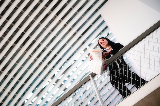
I love this image. What I love most about it is the fact that you managed to combine an artistic flair with a definite theme. It is totally stock photo. You are obviously a very experienced and capable artist. Well done...10
I find those bars, or whatever it is, a bit disturbing. I think the shot would've been better if they had been "smoothed out" a bit to get more attention to your motive.
Good location choice. The lines on the ceiling give great flow and direction while the white wall brings your eye down to the subject. The paper is a tad washed out though.
A nice take on the challenge. Great angle and model placement. The only area I can see that grabs my eye for improvement is taking the model either into the middle or further away from the white wall above and behind her. I would either place her in the middle or with empty space between her and the wall, but currently she is barely covering over into it which gives it a bit of a weird feel for me. Still a great shot and one of my favorites so far.
Nicely done and definitely stock material. Wish it were a little closer on her and less of the ceiling texture. But still one of the tops this challenge - 7







 Add photograph to your favorites
 Add photographer to your favorites

 Photographer found comment helpful.


