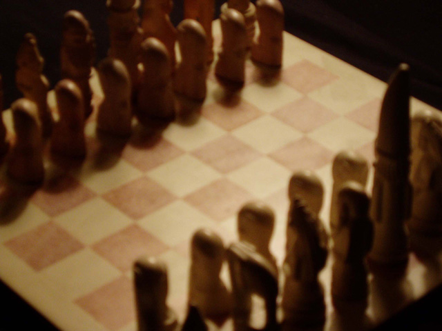
The softness of this is actually pretty pleasing, but I don't quite get the opposite part of it becaus the color of the pieces looks the same. I like the diagonal angle of your composition and framing to allow for the very high king piece. The contrast could be bumped a little higher even if you want to keep it soft.
if i could see the color difference between the two sides, it might be a better shot. it is way out of focus, and if that was your intention, i don't think it works here.
Terrible focus! Even if that were fixed, the image is static. Chessmen lined up on a chessboard. What's different about YOUR perspective? Try different angles, get the thing focused, work on better lighting, move some of the pieces around, and you'll have something interesting.
I think this shot could have significantly benefited from harsher lighting (as it is, I really can't see the difference between the colors of pieces) and from a tighter focus/shallower depth of field. The idea, however, and the concept of "challenge" inherant in the shot are worth pursuing.
I'm sure you've received a lot of comments that have told you this is out of focus (OOF). But I am guessing you knew that. So let's look at something else. It's hard, in this depiction, to tell that the chess players are different. The colors are the same in this very dark image. There is a good feeling of "opposition" though, from the angle you've chosen. But the tight crop here, combined with it being dark and OOF, doesn't have any dynamic, or "pop" as some people refer to it.
Opposite sides of the board? Guess that works, the shot is out of focus, the light doesn't work well for this shot and the cropping and composition leaves me wanting. A 2
If the lack of focus is intentional, it doesn't work at all, I'm afraid. Also, I think the idea of using a chess game to illustrate opposites is a good idea, but it might be more effective if the pieces were the more traditional black & white kind to bring the point home. The similar colors of the pieces and the shadows don't illustrate the theme as well as if there were more stark contrast.
This is the third shot i have seen (so far) that is VERY VERY badly out of focus. PLEASE read your camera manual and practice taking pics so that you can identify ones (like this one) that are out of focus.
I like the shadows. Bringing the light lower would make the shadows longer, and I think they that would be more interesting. But either way, the lack of focus ruins it for me. 3.





 Add photograph to your favorites
 Add photographer to your favorites


 Photographer found comment helpful.


