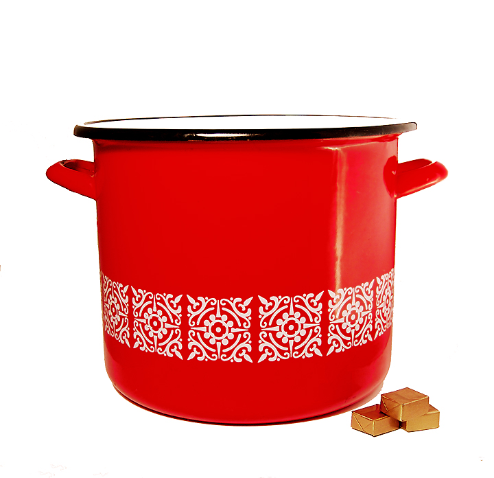
Self-explanatory....a big ol' stockpot and stock cubes, shot and pp'd as though I were going to submit it for stock. Originally wanted to use stainless steel stockpot but couldn't figure out how to shoot it without getting tons of reflections in its surface.
Shot in lightbox with the $2 light on the left and a small fluorescent on the left. Camera on tripod.
pp: RAW conversion, crop, curves, shadow/highlight, clone, hue/saturation, red filter, resize, unsharp mask, sharpen edges, save for web
Statistics
Place: 60 out of 91 Avg (all users): 5.0932 Avg (commenters): 5.3750 Avg (participants): 4.5745 Avg (non-participants): 5.2222 Views since voting: 1006 Views during voting: 344 Votes: 236 Comments: 11 Favorites: 0
Sorry you didn't score a bit higher with this image.
I thought it was quite an amusing take on the challenge topic, but sadly it didn't really meet the challenge in as far as showing the art of cooking. Yes, it is definitely cooking related and yes, it is definitely a stock photo, but somehow it missed something along the way. I wonder if you had put the stockpot on the stove with a wooden spoon or something it may have conveyed the theme a bit better.
Technically I believe there are also some issues with the lighting (some burnt out bits on the rim etc) and also as PGerst mentions, the processing is a bit clumsy (not that I could have done any better mind you!) There are quite a lot of jaggies around the edges which may have resulted from the sharpen edge process.
Overall, I felt this was a great idea, but could have been improved a bit both technically and compositionally.
Fun play on the word 'stock'. I like the red and gold colors and the composition. I'd like to see some color and texture added to the background, because this looks too much like a cut and paste job.
(edited for typos.)
Except for the edges of the pot that blended in with the background, I thought this was a pretty good stock shot. Plus it made me laugh with everything being "stock" hehe. Those seem like cooking items to me!
The main issue I have with this is that it seems clear that the background was selected and either deleted or pushed. The edges of the left handle are way to noticeable.





 Add photograph to your favorites
 Add photographer to your favorites

 Photographer found comment helpful.


