Composition: Subject Placement, Cropping, Background 6
Technical: Focus, Exposure, Lighting, Processing 6
Appeal: Is it Interesting, Motivating, Etc. 5
How well does it meet the challenge: 8
Total Averaged Rating(Rounded) 6
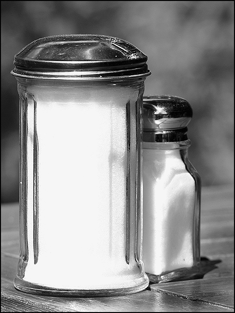
No doubt joining the unseen bandwagon, but you should have done this for the proportion challenge... It's kind of cute. did you try the same set up indoors? I only ask because the whiteness on the near shaker is a little too intense - indoors you could control the lighting a bit and with darker lighting, might have picked up a granular appearance of the salt. you have done a good job of hiding from the reflective chrome surfaces though - i quite impressed by that. 7.
I gave this a five because of the nice clean composition. It is bit to contrasty--the lights are really overexposed and high key. One way you can tell when this is the case is by looking at the highlights on the wood. The grain detail is completely washed out in that area. If your camera has a function allowing you to use a lower ISO rating, or a lower contrast, or a darken image---any of those---you would have a better exposure and a much more successful image.
Very nice lighting and contrast for a B&W. You made something very common appear very special. I guess that is a key to photography! The tops of the containers are a tad bit messy looking against the tight crispness of the rest, but that is nit-picking!
I like the idea of finding beauty in common objects. There are some wonderfully designed objects around us and this challenge was a good opportunity to give them their due. For that reason I'm really liking this image. Most folks woulnd't waste thier time taking pictures of these items. You've managed to bring out thier innate beauty.
Good simple take on the challenge, nicely composed and converted to B&W. But the light is a bit strong on the white sugar (and salt). A little shade might have helped with this difficult exposure.
The black and white is good although I think the contrast may be a little too high as the white of the taller salt shaker is a little too bright, almost blown. The toning is good and the texture of wood table and background go well with the black and white used. The perspective of the table gives it a sense of 'tilted horizon'. The overall idea of giving inanimate objects human personality is cute and of course works better with the tie-in with the title, but works well without as well.







 Add photograph to your favorites
 Add photographer to your favorites


 Photographer found comment helpful.


