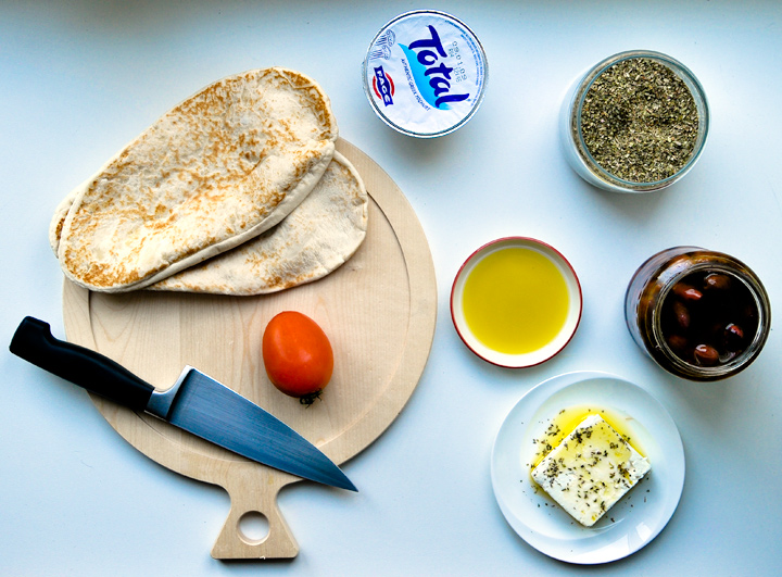
Nice lighting and crisp lines. Composition isn't quite powerful enough though. The spacious placing of all the containers that doesn't seem to add up to any overall shape/pattern could probably be improved.
ok, being picky...your "Total" product should have been turned...for a stock photo you want to be able to read any product labels used...without turning your head
Not bad, although I would have put the yoghurt on a little plate or bowl instead of leaving it in the container and showing the label. It's just nice how everything else looks home made, so it detracts a bit from the global effect.
I think the "Total" label there detracts from the "peasant-ness" of the picture. When I think 'peasant' I think simple, which everything but that label implies. Everything else here works really well though, IMHO.





 Add photograph to your favorites
 Add photographer to your favorites


 Photographer found comment helpful.


