Hmm, the darker side of life. Not too many of these entered.
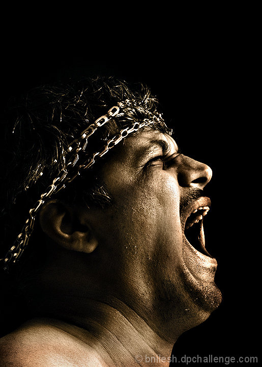
I like the lighting and the detail in his skin/beard. I might have traded some of the negative space above his head for a bit more of his shoulder/body, but it's nice overall. I even kinda like the spacing in the title, even though that usually bugs me : )
A great idea for the challenge and I applaud your creativity. I think this would have been much better face on though... and what are those things around the models head?





 Add photograph to your favorites
 Add photographer to your favorites


 Photographer found comment helpful.


