This is Kari Ann, greetings from the Critique Club:
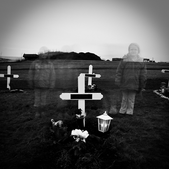
composition: the center composition of the gravestone and the two girls equally spaced from it make this a very standard composed image. nothing wrong with it, but some don't fancy it. i however, think this portrays the space between life and death, amongst other things.
color:sepia is a great choice for such a moody image.
contrast: the contrast is a little harsh in the bottom portion of the image, but i find the rest of the image pretty well controlled in this area.
focus: good focus on the main subject of the grave, and i like how the girls were in focus as well, but they're merely moved.
depth of field: i feel the house adds interest and more depth to the photo, not a distraction.
lighting: moody lighting, and great sky, very stark and barren
other: i think this should have score much higher than it did. the only reasons i think people may have underestimated this photo is for the darker subject theme, and the harsh contrast. but, as for me, this portrays so many things: the children grieving for their lost loved one, the space in time between life and death, the space between young and old, dead and living, spirit and body, ect. you captured such a great thought provoking image. my hats off to you. if you have any other questions, feel free to PM me anytime.
-Kari Ann
Well, that's depressing :-( A bit dark, but that's appropriate for the subject. I think I'd like it better if I couldn't see houses in the background,maybe a closer crop and/or slightly different angle? It would look more lonely that way.
This is a creative take on the challenge, which is to be admired. I like the black and white as I think emotive portraits such as this are better in black and white tones. However, I do feel that the contrast could have been less so and the shot brightned up a bit. Not sure about the circular shadowing at the top either. Good focus.
Interesting image. A bit contrasty, and the ghost on the left could have had a stronger placement either higher up (to see her head over the horizon) or lower to see her against the dark background.
right, life is till we die...nice approach!
looks like one of those lonesomes cemeteries in the icelandic outbacks.
your "ghosts" look a little too posed and static to cenvey your message imo. b&w and tones work well!





 Add photograph to your favorites
 Add photographer to your favorites


 Photographer found comment helpful.


