Hi Jan,
Greetings from the Critique Club...
Your few comments can only mean one thing -- you've fallen in that "average" photo score range -- this can be tough because they are quite positive yet the photo didn't do as well as the comments would suggest. (I am impressed that sfalice got the location right!)
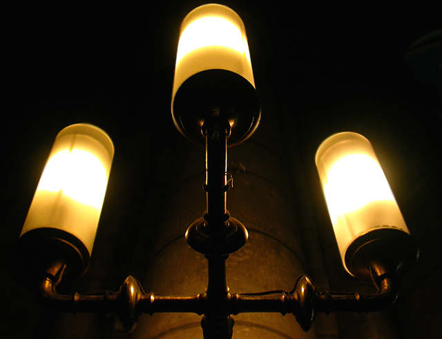
This is a fine shot so I'd like to explore why it didn't do better.
This shot has many + but no one big +. The composition is well done, symetrical and balanced but there is no tension or interest in it. It's more solid and square, not captivating. The lighting produces shadow areas and brightness but there is a lot of shadow without any detail in it so it doesn't provide the "hook" for interest. The technical issue of blur is a minor detractor. The color is two toned but clearly color (the suggestion of sepia or b&w hints at a way to get around the two-tone color by placing it in a different way -- I would be interested in seeing if that treatment would have kept the warm glow that trying2bstill liked)
I think you filled the frame well with your subject. Any further away would have been a negative.
I hope this was helpful. Please feel free to pm me with any questions.
Regards,
Theresa
|







 Add photograph to your favorites
 Add photographer to your favorites


