This is Kari Ann, greetings from the Critique Club:
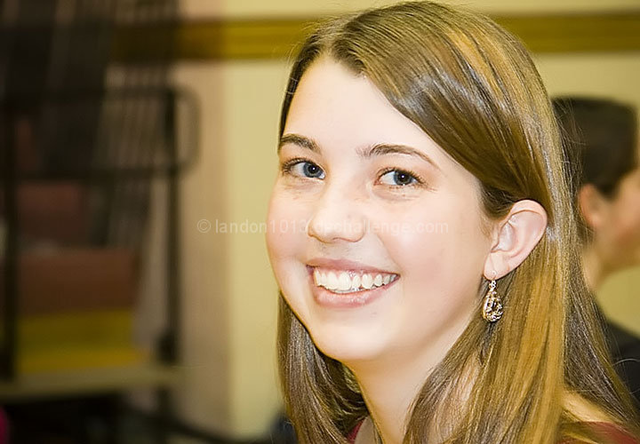
composition: the subject is placed nicely in the frame, her shoulder leads the eye right up to her face and eyes
color: a little flat and orange, this could have been caused by the white balance. that or the lighting in the room was a bit flat
contrast: nicely controlled contrast. nothing overpowers the women, thus making her the main subject and the first thing our eyes go to
focus: focus is good, clearly on the subject of the image
depth of field: an increased or shallower depth of field would have made this better to blur the background person more.
lighting: pretty flat, either due to weird lighting or strong flash.
other: overall, its a good portrait of a very pretty girl with a strong smile. But, the lighting, artifacting (see yospiff's comment) and distracting background all degraded the beauty of the image. i think with a little more practice, you can really set your portraits apart from the pact, and get your score higher. keep trying, and i look forward to seeing you improve. If you ahve any more questions, feel free to PM me.
-Kari Ann
Colors seem washed out or artificial somehow (From flash perhaps?). I think there is also a lot of JPEG compression robbing detail. I can especially see some artifacting around her mouth and nose. Your 67k file size indicates you could have used much less compression and gotten much more detail into this. Always save your file as large as possible within challenge limits. (200k for this one.)
Oh man, just lost my lengthy comment for you. So I try to recreat it:
a very nice smile ind deed. You model deserves a little more attention from your side:
Lighting
the flash you used could either be bounced off of some surface like the ceiling or a simple white paper. the flash could also be diffused by having a semitranspararent object between the flash and your model. THis will eliminate the harsh bright areas around the cheek bones, the nose, the teeth and the chin.
Background
the left part adds some environmental relation and supports your picture. the person on the right side though should not be in the frame at all. Your model deserves some more attention by you so the viewer can completely focus on her and not trying to figure out what the other person is doing in the picture.
I guess I was able to recreate the lost comment :)
BTW: focus is dead on, good detail in the hair, catch light in the eyes. THere are strong parts in your shot :)






 Add photograph to your favorites
 Add photographer to your favorites

 Photographer found comment helpful.


