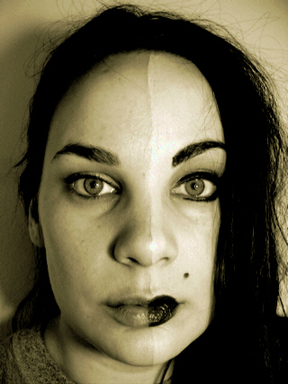
A great concept. I wish the photo was larger and a little crisper focus because it's a wonderful comment on beauty. The choice of sepia is very nice, I like the qualilty it lends to the light and texture.
Normally I'm a devoted fan of B&W's and Sepias. In this instance, though, especially using a model with such vivid and striking eyes, I feel that color would have been your best tool to show the "opposites". Having the rich reds of the lipstick, the blue or green of a heavy eyeshadow, and the other richness that color would have lent the piece would have most likely made a significant difference.
I like this idea but the sepia doesn't really work with this shot for me. I think either leaving it with the color or going black and white with a higher contrast would really make this shot pop out at me. Also the lighting needs to be more even, the shadow on the left is very distracting. A 4







 Add photograph to your favorites
 Add photographer to your favorites


 Photographer found comment helpful.


