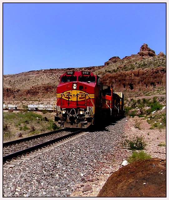
I like the contrast of the brightly colored locomotive against the earthy background and the bright blue sky. I like that you can tell the difference between the color schemes of the two locomotives. The color definition in this shot is wonderful, but it appears a bit over-sharpened in the background.
Composition: Subject Placement, Cropping, Background 6
Technical: Focus, Exposure, Lighting, Processing 6
Appeal: Is it Interesting, Motivating, Etc. 5
How well does it meet the challenge: 8
Total Averaged Rating(Rounded) 6
What a nice train picture. The colors are great and so is the composition. It looks perhaps a bit oversharpened. It looks like the heat from the exhaust is changing the focus on that rock face behind the train - kind of cool.
Whatever that thing is in the lower right corner seems to take my attention from the lines of the track and the train. Maybe if you took one step forward and cropped just a little more. Stil, I love the colors and the idea. 7.
Classic train image taken at exactly the right moment. Even the tilt of the first engine works well. The overall quality of this image is not as good as it might be. Above just to the right of the engine the rocks appear smudged and out of focus different from the rest of the image. That is an effect I sometimes get from NeatImage for noise reduction. The rest if the image seems to suffere from that but to a lesser extent. That is too bad. This is an otherwise good setting and a nice capture.
I gave this a five. I like the overall perspective. I think waiting until the train was looming closer in the frame (or moving in closer if it's not a moving train) would have created a more imposing subject. The overall seen is much too contrasty. I don't think you need quite as much sky. If you can go back and do this again (lowering the contrast on your camera if you can) you have the makings of an excellent shot.







 Add photograph to your favorites
 Add photographer to your favorites


 Photographer found comment helpful.


