This is my own personal voting scale. It's merely an huble opinion, based on whatever limited photography knowledge I have. You have all right to agree/disagree with me.
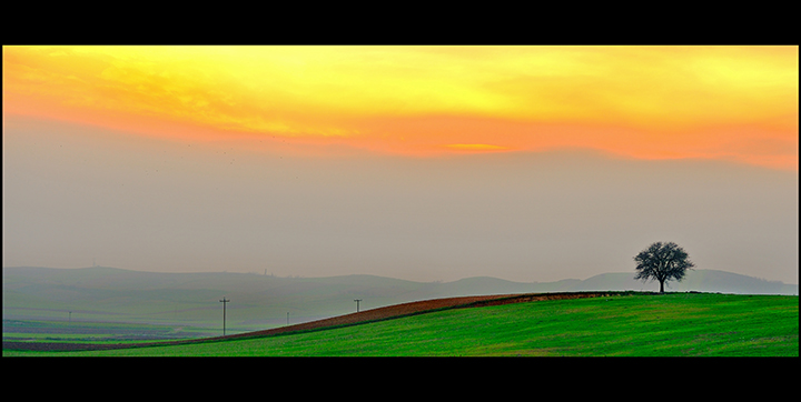
8 - Wow. Very nice. Like your framing. Maybe, a little more land at the bottom for additional balance - if it was there of course (and your call anyway, also 'of course') - very, very minor - but looks like something poking up mid to right at the bottom of the frame - which could be why there is not more 'fore'. Nice shapes, colors and elements. Overall (and I noticed this at first too), could be a visual thing and/or perspective thing, but looks like it needs the thinnest whisker nudge rotate up on the right to straighten, or a perspective correction - perhaps more noticeable on the shape of the land in the distance on the left. But you may find this all too 'nit-picky'... if so, just ignore ":)".
Sometimes the intense over saturation bugs me but this works great. I love the undulating line of the landscape and the pops of yellow and green. Nice composition with the power poles and single tree. 7
I don't know if you realize this, but your picture has created a special meaning for me. I was immediately drawn to it when I saw it in thumbs. And opening full, did not disappoint me at all. Wonderfully done!
Now the special significance: It denotes the colors of Indian Flag. Ah!






 Add photograph to your favorites
 Add photographer to your favorites

 Photographer found comment helpful.


