For my NYC Top of the Rock session, I shot something like 250 originals; I was there well before sunset and waited to see what it looked like. It was so fantastic though, that the daylight ones literally pale in comparison.
But still, with quite a few shots during sunset, I only processed one:
I did reprocess it at one point though, and made a beautiful canvas from it recently.
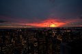
But I had many more, and with 250 shots in the folder, it was cleaning time. So I took this original, which was shot at 10mm:
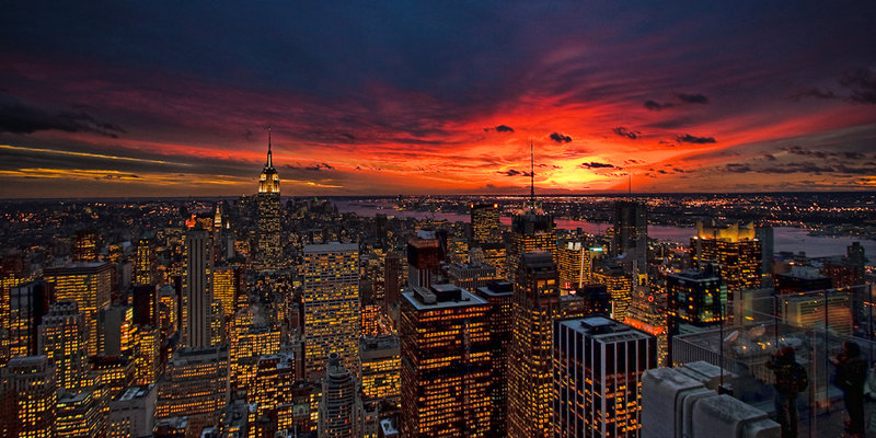
and produced the current image last night, mostly from LR adjustments, but then a bit of PS to bring out the lights a bit more.
What do you think? Do you like this one better than the Nature's Palette in my portfolio, or the Canvas version? What about the observation area visible on the right? Does it detract? Should I darken it?
This is a beautiful shot, Neil. I prefer the wide perspective over the other, but prefer the window lights to be a bit more white. The observation area doesn't distract at all for me.
I think that this is incredible, but when I look at Nature's Pallette, I prefer it. Thanks for the link to your canvasses. They are fabulous. You must put enormous effort into being in the right place at the right time, and the rewards are immense.
Not only do I love this wider version but the color palette is just stunning! I LOVE the more detailed look of the buildings and the orange glow of the lighted windows. My eyes just seem to flow over the whole scene and I want to drink it all in. As for the observation deck, I think it's wonderful and provides a depth and perspective not often seen in the run-of-the-mill skyline photo. It also adds a human element to the city. I might even dodge the people and deck to see if I could bring them out a bit more! :) Beautiful shot, Neil.
i like this one better than the one you have available for print. I like seeing all the detail in the city, and the sky is quite intriguing. But for me, the bright orange and yellow sky compete with the foreground. I don't think there's much you could do about that but it makes me wonder what if you desturated more of the color in the foreground (I'm thinking the cyans), toned down the orange and yellow of the city lights, and let the sky be the star? Sounds like a lot of work lol. In any case, I'm envious of you being able to capture a photo with so many interesting details in it.
brilliant original photograph neil ..
i prefer this wider angle but i personally like the colouring in your cropped 'natures palette' .. the lighted windows with the less yellow look & the darker/blacker buildings .. but that's just my opinion ..
that sky is amazing with the clouds forming such wonderful patterns, shapes and colours ..
i see wot you're saying about the viewing area, but i like it .. !!
it would definitely make an excellent print .. :)
i just looked at your canvas version after saying all that and that's the colouring i prefer .. but i still like the wider angle .. :)
I like this one better than all the rest Neil. The golden tones of the city lights work better for me with the sun still setting. I don't think the observation deck to the right detracts form the overall scene and I do like the wider angle.
I think I actually prefer this one to the entry (though they are both great). I like the wider view and the golden glow from the windows in this version.
All I got to say is wow, I love it! The colors, the details of the lighting in the buildings. It all flows so nicely together. I think I have found a new fav!
I agree, the people pull my eye a little, but not the structure, and not until I've looked at it for a little while. So as a print, yeah, I'd probably choose to burn in that lower corner a bit. Love the width and the perspective.
I agree with Melethia... this one is better because of the wider view. I am unsure about the observation deck however. There is a lot going on in the shot, so I didnt notice it at first, but even now that I know its there, I dont find it a distraction because it isnt very bright or prominent, so I still end up looking at the buildings/sky/sunset.
What building where you on when you took this photo? (yes... If I am ever in NY I hope to try it myself)
The colors in this are gorgeous! I don't mind the viewing area at all. It adds a bit of interest to it with others enjoying the view. I prefer the sky in this one with the brighter spot of yellow, but the other pic is phenomenal as well.
1 - I actually prefer this one to your print one. Why? Because I LOVE the wider view. To me it has more impact and you get a wider, fuller view of that gorgeous sky at sunset. 2 - I don't mind the observation deck, and not sure you should darken it - it may draw more attention to it if you do. Really is a stunning view and you sure picked the right time to go freeze your fingers off to shoot it. Heckuva nice outtake.
I don't necessarily think the viewing area detracts, but the people there do a bit. Maybe clone them out? This is certainly beautiful! Vibrant, almost volcanic colors! I'd be hard pressed to put them in order of preference, they all rock!
Wow, hard call since they are all fabulous! I like this new one best, though, with the canvas version second best. For some reason I like the golden lights better, maybe I equate the color warmth more with sunset.






 Add photograph to your favorites
 Add photographer to your favorites


 Photographer found comment helpful.


