Processing:
Shadows/highlights - played with the fine tuning settings (tonal width and radius) but really don't have a good idea of how to use them.
Levels; curves, with blending mode set to Screen then reduced in opacity a bit; added a new layer, then put a black to transparent gradient from the upper right side across about 1/3 of the way and changed the blending mode to soft light, just to darken the blown out parts there a bit. Cropped. Duplicate layer in soft light blending mode, then reduced the opacity to taste. Flattened, then created another duplicate layer, applied a bit of gaussian blur but erased it from the boy and the foreground. Flattened, then sharpened a bit.
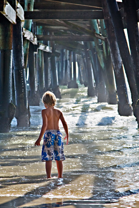
I just want to know what he is looking at. This has a very dreamy feel to it. Honestly I don't even know where to start, I really like this shot. I can see myself in him, the curiosity, the willingness to look further and see what most of us don't.
The lighting on the boy is great and the blue shorts work nicely. I'd like to see it with a darker/moodier lighting on the BG piers. Maybe play around with a heavy vignette??
I have to agree with everyone else, this is fabulous in color! The blue one is nice, but since he is darkened for me the focus ends up being on the water and pier instead of the boy (even though I love the glow of the water). The B&W is beautifully converted, but he does seem to blend in a bit too much. In this one I relate to the boy, I hear the waves and smell the ocean :-)
Out of all three, i like this one the best. I like the depth given by the peer, and the shadows caused by the pylons really give alot of interest to the photo. I also like the soft light hitting your subject on the head and back. Just seems to flow together nicely.
I like this. The background is great but it's also very busy, and a little something is needed to make the boy stand out. The color does it. In the black and white shot, you have to work a bit harder to find him.





 Add photograph to your favorites
 Add photographer to your favorites

 Photographer found comment helpful.


