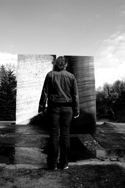
A shadow makes one of the two rocks in the artwork dark while the other is bright.
Post processing: Image desaturated and given a little more contrast.
Statistics
Place: 133 out of 286 Avg (all users): 4.9621 Avg (commenters): 5.2500 Avg (participants): 4.6612 Avg (non-participants): 5.1775 Views since voting: 1072 Votes: 290 Comments: 10 Favorites: 0
I like the concept. The man blends into the rest of the image; I think the idea would come across better if he stood out more. It might be possible to do that by brightening the image enough to get some detail on his legs.
I like the balance to this and at the same time its lack of symmetry. Of course black and white is a natural choice for this and I appreciate that the contrast isn't too blown out.
Needs more contrast. Your person almost fades into the dark side, or is that intentional? This might be more effective if taken from behind the subjects shoulder and just include the head and the 2 backgrounds. 7
interesting...could use some fill flash on his legs..the knind of blend into the scent too much, a black hole type effect. also, the back of his head does not seem to be in focus. not cropped evenly (left to right) and seems tilted (the stone tablet tops are not level). Could have been outstanding..






 Add photograph to your favorites
 Add photographer to your favorites


 Photographer found comment helpful.


