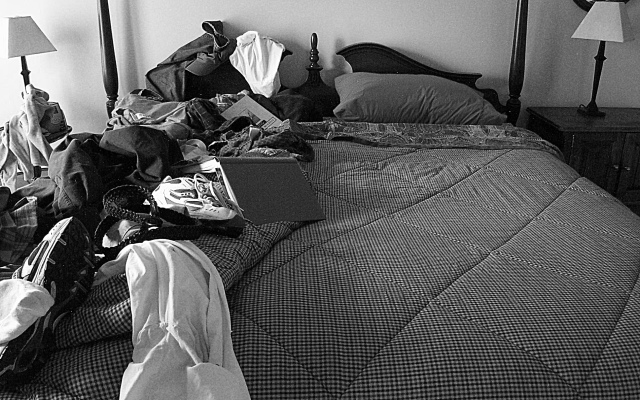
The idea of my side of the bed always being messier than my wife's side struck me as a unique idea to convey the opposites theme. Of course this is staged to be much worse than normal - really! Used some unsharpen and desaturated the image. I felt like the different colors in the original image became too busy, so b/w would help them to blend together into one collective mess.
Statistics
Place: 42 out of 286 Avg (all users): 5.6486 Avg (commenters): 6.2500 Avg (participants): 5.5492 Avg (non-participants): 5.7184 Views since voting: 1204 Votes: 296 Comments: 18 Favorites: 0
Gee - I wonder which is which? But then, I guess those are men's clothes. Nothng in the rules about "sexist" submissiobns! Very well planned and executed. The only slight problem I have is the keystoning effect on the two lights on the left/right edges.
The left side looks like my room, LOL but all around the room!
The shot isn't bad overall but the it leaves me off for some reason. I think it's because the left side isn't quite even with the right, the cropping seems off also, the lamp got cut off on the left but is whole on the right. Also the lighting is harsh on the right and too dark on the right and there seems to be some noise on the right side. A 3
Great idea for this challenge! The choice of black and white works to unify the elements in the picture. At first the staging felt a bit over-done to me. But I realized it's actually a bit under-done--I think "her" side needs something on the night stand. She may be a neat freak but I expect she has some personal belongings such as a tidy arrangement of photos, or neatly arranged books. Overall, very nice. Good light, focus, etc.






 Add photograph to your favorites
 Add photographer to your favorites


 Photographer found comment helpful.


