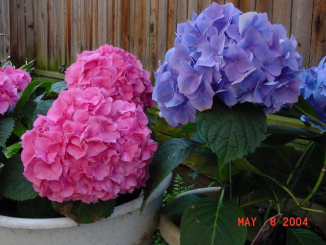
I am not down grading your photo for it because it is a nicely done one but do yourself a favor and remove the date stamp for your contest photos. You may have done it on purpose but no need to. Good work.
If I were you I would take out the dating stamp of images.
For the image it self then the subject is fine. Maybe thighter croping from below would have been better and maybe from the sides too.
I like the colors of this one. I would like to see it from a more creative angle though, and I know you're tired of hearing it by now but it'd be a lot better if you'd either turned off the camera date or cropped it out... nice job though!
I understand the rules, but please turn off your date next time. It really distracts from the pic. Also, get down a little more on level with the flowers, so the shot is straight on instead of from above
im sorry, but this just doesnt represent opposites. i understand what you were trying to do by comparing boy & girl, but it could have used a litle more thought. right now your just comparinf pink to blue, and those two arent really opposites.
Flower hues are nice, but do not contrast (e.g., red vs. green or blue vs. orange). Blue petals seems out of focus. Greens are very dark, perhaps too dark, and could have contrasted well with the reddish bunch of flowers.
Ouch. Gotta get rid of the time/date stamp. too many distraction in this image as well. The pots, the fence, the shadows. the colors could be a bit more saturated also.
Not really opposite in colour, shape, type or composition. In fact the only thing you've done opposite is leave the date on your picture which is the opposite of what most people would do. (2) coz at least its in focus.
I don't find this interesting. Not enough of the flowers. Maybe coming in closer and filling the frame with the flowers would help. Oh yeah, and turning off the date stamp. 4
Hi -I think you could of improved this shot in two ways.
Move the two large blooms closer and more focus...tripod.
Also this is a little dark, maybe boost the whites some.
Good luck in the challenge.
A couple of pieces of advice for submitting shots to DP Challenge (to get a score above 5) - it took me a while to learn this informaiont as well:
1) never submit somethign with the date -at the very least crop the date out.
2) if you're going to shoot flowers (personally, I like flowers) go right in really close and get some sort of interesting angle (there's one of a spider sitting right inside a flower petal that is cool in this challenge - as an example - I gave that one a 10).
3) People in the DPChallenge forums are always complaining about flower shots. They say flowers are boring and have been done way too many times. Personally, I like a flower shot if it's interesting - if it has something I"ve never seen before (like the spider in the petal). You may find you get lower scores just for shooting a flower.
Good luck in future challenges - I hate seeing people get discouraged by negative comments. However, I know it can be difficult to see a low score and wonder why.
For some interesting flower shots... visit www.comstock.com and search for flowers. There are some innovative ones in there that show interesting compositions.







 Add photograph to your favorites
 Add photographer to your favorites


