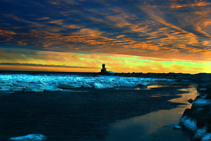
Top half - good. Bottom half - dark on my calibrated monitor. Horizon feels tilted to the right slightly (I'm a nut about unintentional tilt). Maybe try moving the horizon line up (or down) a bit so as not to split the frame exactly in half.
Really cool, but the colors look so unnatural. Then again, I don't live near any iceflows. I wonder if this is there natural color and I'm just unfamiliar with it. Horizon slightly tilted. What's that thing in the center?
I hate to admit that I like this in spite of the over saturation in the sky (that I truly dislike). I think moving a little to the right so the building was to the right in the image while still retaining the ice on the right would have improved the image.







 Add photograph to your favorites
 Add photographer to your favorites


 Photographer found comment helpful.


