Hi Amanda and * Greetings from the Critique Club *
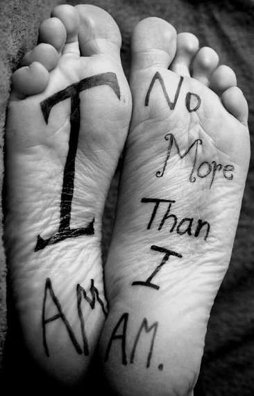
Yes - it's definitely a new style of self portrait - very original.
It's ironic, but your image finished right next to mine in the challenge.
Note that even the commenters who didn't rate the image high had an emotional reaction. That means the image is a success - as it should be.
It is very creative - even the way you elected to write the text: font, text size, positioning and boldness.
The "printing" is just a tiny bit less contrasty that I'd like, perhaps because the backgroud is such a middle value. Did you try a very dark background? Note how well the image looks in the bottom right corner with the dark background next to the ball of your left foot.
Compositionally - it's near perfect but perhaps a bit crowded on the left, right, and bottom.
As you know - these are just "one man's opinion" on how you might take an already great image and make it even better. Thanks for sharing it - and I hope the magic marker wasn't that hard to remove.
I gave this a six. I like it quite a bit but somehow I didn't feel I wanted to give it a higher rating. I can't quite put my finger on why. I voted yesterday and am commenting today. I may have given it a higher rating today so it just may have been my mood. I think I just don't care for the saying. I like the idea.






 Add photograph to your favorites
 Add photographer to your favorites

 Photographer found comment helpful.


