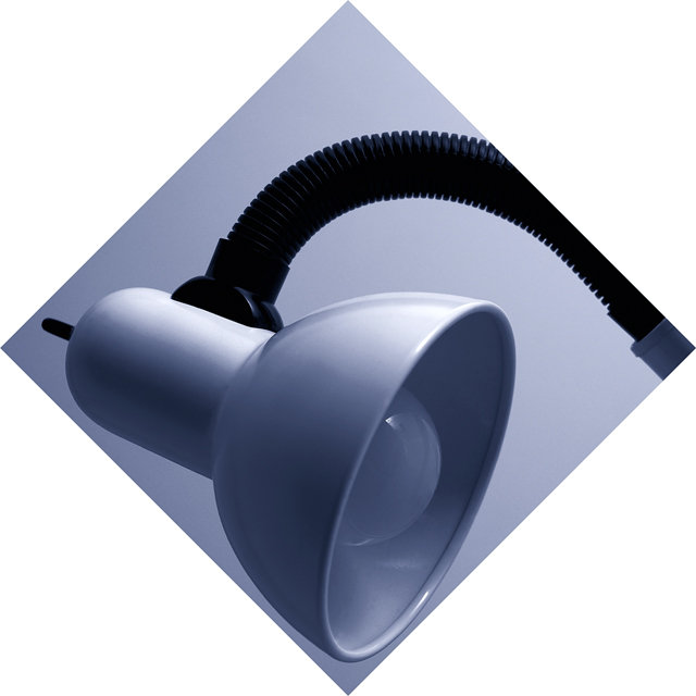
I have never shot a desk lamp before. Somthing that is pretty simple but I tried to make it interesting. I took the image in my basement, never shot anything there before. I used other simple desk lamps and white cards for the lighting. The final product is just the image rotated 45 degrees and left just as photoshop puts it. Never did that with an image before either. Hope you enjoy.
Statistics
Place: 151 out of 187 Avg (all users): 4.7251 Avg (commenters): 5.2143 Avg (participants): 4.5631 Avg (non-participants): 4.9706 Views since voting: 1111 Votes: 171 Comments: 17 Favorites: 1 (view)
The more I look at this, the more I like it. The whole appeal of it is how it's nestled within the inside frame. Without that inner square, the photo wouldn't be nearly as interesting though I have to agree with the other commenters about the neck being cut off. If you should ever reshoot it, try getting it all the way in, but make the neck more angled so just the it and base can be applied on another layer so they run out of the inside frame and into the outside frame. I can see it so clearly in my head that way.
Anyway, a very creative shot.
Unbelievable. I expected a top 10 finish on this one! Well, I'm adding it to my favorites, anyway. I still really like it. I guess I can see the point that the neck of the lamp perhaps could have been included in the shot somehow, but I really like this just how it is. I gave it a 9 (the highest vote it received, apparently), and I stand by it. Congrats on a nice photo.
Points for an interesting frame, but the white corners bring out the reflections on the lamp making them seem almost blown out. A more neutral color would have been better.
I really like the lamp photo. The coloring, position, and focus are really nice and I could see it alone being an advertisement or office-type print. However, the diamond pattern and the white surrounding border is very distracting to me and really takes away from the beaty of the lamp's curves and lines.
Arguably more about the presentation than the photograph, which I'm sure will hurt your score here. Tonality of the lampshade itself is very well done, great movement in the shading, though personally I would have tried to take it a little further, or perhaps even to lose the stalk and switch, so that the black point could be set even darker and emphasise more that shading. Not an easy subject to get so clean - especially shot in natural light (the rflections in the light-bulb are pretty revealing)
Thinking inside the box? I like the way you presented this. I do think that the white balance set correctly so that lamp was white would be a stronger presentation. 8 -danny
Interesting idea with the border but somehow it doesn't work for me. Another suggestion is to switch the light on but don't use a bulb with too many watts!






 Add photograph to your favorites
 Add photographer to your favorites

 Photographer found comment helpful.


