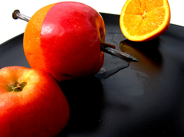
Taken outside on my patio table. This picture actually has multiple definitions of the opposite theme. Black and White ,Apples and Oranges, Face up, Face down ,Wet and Dry, Opposite ends(of the nail) I wonder how many will pick up on this.
I cut an apple and the last orange in the fridge in half and drove a large nail through the two halves.
I put it on a black plate (the only black one we have). Took a multitude of arrangements finally ending with this macro shot.
Although the apple and orange look perfectly mated they are far from it only the angle of the shot gives this illusion.
A little adjust levels ,,sharpen then resize to meet challenge specs.
Canon PowerShot A80
Shooting Date/Time
07/05/2004 10:07:41 AM
Shooting Mode
Manual
Photo Effect Mode
Vivid
Macro
Statistics
Place: 22 out of 286 Avg (all users): 5.9367 Avg (commenters): 6.7895 Avg (participants): 5.8062 Avg (non-participants): 6.0351 Views since voting: 1843 Votes: 300 Comments: 22 Favorites: 0
Beautiful lush colors. I like your choice of the black base and white background. The texture on the orange and apple are a little lost with the DOF that seems to favor the orange in the background. Great idea, wonderfully executed. You composed the photo very well with excellent use of the negative space on the lower right.
I really like the idea of apples and oranges. I especially like that you didn't just photo apples and oranges, but mashed them together with a nail. Great shot!
First of all, i don't get your title. If the b&w has to do with the tray and background, okay, I guess I get it. Second, i don't think apples and oranges represent opposites so much as they represent things that are different (and often not comparable). So I don't think you met the challenge. That said, putting the apple skin over the orange is quite clever.
I'm not picking up the relationship between the b/w and the apples oranges. I'm also not seeing the role played by the nail. I think I'd try to pick a single theme here so the image could make a stronger statement.
Ah - a "double" entry - very clever. Your colors are right on as is the exposure. But I do have a problem with your composition. The top of the appleorange is very crowded at the top, should be a bit more space above. And, I think it would be better if the entire orange half on the right were included in the frame. Overall - a very ORIGINAL idea very well executed.
Nice picture. I'm having trouble coming up with any constructive criticism for you. Maybe taking the brightness of the white background down a notch would keep it from stealing some attention from the fruit?
First off, it was a good idea using the black as the base. I like how it dampens the reflections a bit so more focus is on the actual fruit. I like how you put the pieces of the apple and orange together. The leftover orange is too far away from the rest. It's almost like an afterthought. The other apple is too close in line with the nailed together fruit. (Is this making any sense?? LOL) Maybe sitting the half apple/half orange together, where one is just barely leaning against the other would have brought it all together in the center of the composition. On the other hand, there is just enough white background to balance. Overall, I think it's a strong shot.






 Add photograph to your favorites
 Add photographer to your favorites

 Photographer found comment helpful.


