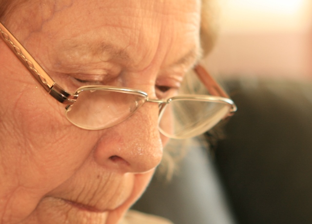
Compositionally, this shot is done well, I think. It is fairly balanced between the face and background, but may need just a smidgen more at the bottom -- maybe include more of the chin.
Technically, the first thing that strikes me is that it is out of focus. However, upon second glance, I can see that the glasses do indeed seem focused. However, since the face takes up more of the frame, and is the primary "focus" (no pun intended), the overall impression that one takes away from the shot is that it is soft.
More than that, though, her face color is very similar to to the background color in the upper third. This gives a very subtle impression of a lack of contrast. I'm wondering if a bw conversion would have helped this, or if having more contrast in the color version could have minimized it.
Overall a shot to be treasured for years. Nice work.
The glasses seem more in focus than the face. That makes it a picture of the glasses - like in an ad. I like the soft focus on the face though. But then the glasses should have been out of focus as well.
The leading edge of her glasses is in focus. The rest is less so. I would have tried to place the point of focus on the closer eye. The close up shot is great and the light is well managed. The BG is just a little distracting - not great but not bad, either.
Feels a little out of focus and the frame of the glasses is slightly obscuring the closest eye. The light area in the background is also a touch distracting, raising the height of the camera and looking downwards a touch more would have solved a couple of these problems.







 Add photograph to your favorites
 Add photographer to your favorites

 Photographer found comment helpful.


