First off, I was one of your 3 nines, so I obviously like it. :)
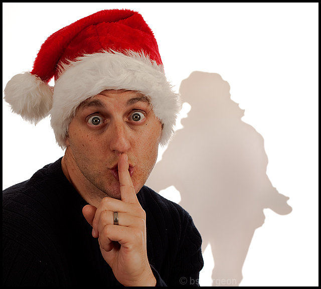
Compositionally, I really like how the main subject is "anchored" in the lower left of the picture, and is balanced by the shadow on the right. I think the balance would have been stronger if the shadow had been a bit further to the right, though. I also think the square (or nearly square -- I didn't measure) works well.
Technically, the exposure is good as well as lighting, color, focus, etc. The contrast level that several mentioned looks good to me, unless they are referring to the shadow -- it would have been nice if that was darker, somehow.
Overall, it is a technically strong shot, and it meets the challenge. When I first looked at it, I could tell the shadow was Santa. But, looking at it longer, I can see how some may not have seen that, and as a result, the shot may not have been as obvious. The expression is also great!
Ok you go have a look at my pics and you will immediately discount anything I say. So, thats+6 settled. I don't know poop about poop about this stuff...for some that is a very good thing..for others not-so-much. So, neither here nor there I can vote and do.
I liked the shot of you, think that is fab! but that shadow (not the 5 o'clock)...I didn't like it so much..it was contrived a little to much. My eye wasn't feel'n it (no my eyes don't really 'feel' you know what I mean!).
So, if I gave you a lower (I'm totally not a super-bitch and give out nasty numbers) I'm sorry...bottom line it just didn't tickle my fancy. *shrugs*
But I love your work, love you and your grungy unshaven face!
xox
Happy New Year baby!
@Ken and Deb...thanks, actually that helps. That was my intent as it is a fantasy. Although I must admit, I gave my neighbors hell for not having a wooden Santa shaped like me! ;)
1st of all, I didn't vote, but it would have had a 6 from me. I think it's a clever set-up, and I like the humorous pose...but there's some technical issues. The red cast on Santa (which you mentioned), and look at your hand/face skin tones...it totally lacks contrast, like highlight/shadow run amok on the highlights. There's no detail either there, or on your sweater. And you needed a shave. But 30 out of 125 ain't too shabby, is it?
I'll kinda echo Ken's comments - the technicals are very good (as they always are with your shots) but the "shadow" seems to be a completely separate from the foreground - ie another element of the shot but not related as one would normally expect a shadow to be related. Does that make sense? Your expression, however, is quite fun!
5.6 is reasonably well. :) The concept is good - only problem I see with the execution is (to my thinking anyway) that the shadow should more closely match the foreground in terms of scope - would be hard to use a bust of santa and convey the idea though, so I think if you got your whole body in the shot and mimicked Santa's pose, it would have struck a better chord with voters.





 Add photograph to your favorites
 Add photographer to your favorites

 Photographer found comment helpful.


