It looks like I may be becoming your personal critique provider :)
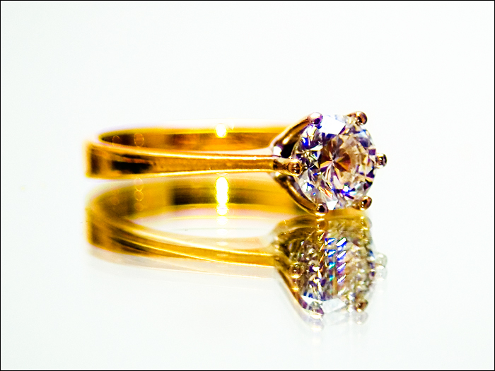
Camera Work/Technical: I do like the crisp focus on the diamond. Your primary focal point is exactly where it should be. I can also see the voters' complaints that the image looks soft. I personally like the shallow depth of field, and I believe that it is exactly what you were attempting to capture. However, images that seem soft often do not do well here. The coloring and saturation do feel a bit too warm for my taste. With just a little bit of a cooling filter, the yellows are toned down, and the reflection is also a bit less harsh and distracting. It also brings out some very nice blue hues in the stone itself. Here is what I envision it should be:
Lighting: Again disagreeing with some of your previous commenters, I also like the high-key feel tat you created.
Composition/Content: The centered composition fits this capture very well. The reflection, though, is horribly distracting. Reflections are hard to capture, especially with a normal mirror. I just bought a large piece of frosted glass to see if this will capture reflections better than a mirror. The problem with a standard mirror is that the reflective surface is below another piece of glass. There is a pretty good discussion HERE about using a painted piece of glass. There is also a specific type of mirror that has the reflective surface on the outside, though the name of it escapes me right now. I tried to scan the forums for it, but we have the most unfriendly forum search tool. You may want to take a look there, and I wish you better luck with it.
My Opinion: You met the challenge well, thought that particular ring will probably look out of place on your hand. Although, you may grab some attention from a whole new crowd. I think that the voters were a little harsh on this one, but the yellow hue is tough to overcome. Without that, I think this one would have been better understood, thus pulling a bit better of a score.
Thank you for the opportunity to provide a critique on your entry,
Eric
I think the reflection is a little too pronounced and frenetic looking - could be more subtle. The focus on the diamond is good though. That's a pretty nice ring- I hope you get it. :)
not sure if you wanted the reflection to look so blurred. but the shank is very oof..seems like you could get the whole ring in focus...and the reflection being oof wouldn't look so off






 Add photograph to your favorites
 Add photographer to your favorites

 Photographer found comment helpful.


