I put 'star colors' into Alta Vista Babel Fish and translated to French, German and Italian. I liked the Italian best.
I shot a version of this late last month for the Backlighting IV challenge. I did not like how it turned out backlighting wise and there were some focus issues as well. This one is much better focus wise.
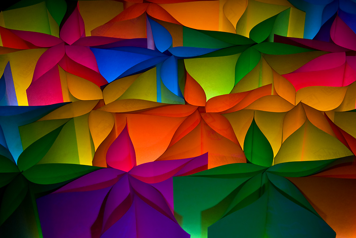
Fashioned about a dozen and a half stars out of PopUp PostIt notes of 5 different colors. Placed them on my light box. Shot with the camera on tripod and cable remote. This was shot with the ambient light of the white box and I used a small flashlight to illuminate the front of the bottom most stars.
Post: Camera Raw adjustments in PSElements 6.0. Layer adjustments for levels, brightness/contrast and hue/saturation. Spot edit some dust and a few pieces of schmutz along the edges of a couple of the stars. One crop. Adjust sharpness. Resize. USM.
***************************************
Post Challenge: Wow...did not expect to be back so soon, as it were. Thank you for all the great comments both during and after the challenge. And Robert ( Bear_Music ) thanks for the great new word (for me).
Statistics
Place: 3 out of 87 Avg (all users): 6.5366 Avg (commenters): 7.6364 Avg (participants): 6.3696 Avg (non-participants): 6.6017 Views since voting: 6624 Views during voting: 384 Votes: 164 Comments: 44 Favorites: 16 (view)
This is pretty, and I've been meaning to try a paper and light shot myself for a while. To be honest though, my reaction is a bit - oh, not another one of these! At least your paper is not curled! :) - 6
there are a few spots where i can see the words
"post it note" on the post it notes! haha
overall, nice and colorfull, but a very
overused idea.
if this is your first time and you wanted to give it a go though,
i say bravo! you have way more patience than i do!
I know this is going to draw opprobrium because it's "just another backlit paper picture", but I don't care. It's exceptionally lovely, and a lot of effort has gone into it. My only quibble is that the lower left corner has gone too dark and is damaging the luminosity of the composition a little; my eye keeps being drawn there. Should ribbon, it's a very joyous image.
I love the colors and the design. Noticeably darker than I would have expected - but this has enriched the color tones positively. The shadows in the bottom third of the photo are the only criticism I can point to being a detraction.





 Colori di Stella
 Add photograph to your favorites
 Add photographer to your favorites


 Photographer found comment helpful.


