wish it wasent such a close crop, but that may have been what you were going for, just my opnion. i do, however, really like the theme you portrayed, i would have never thought of that..
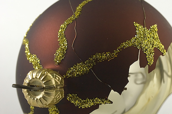
I would have liked a little more depth of field here, so that the edges of the ornament would have remained sharp. A little more saturation, and a little more contrast would have brought out the color also. As is, the ornament looks a little faded. Like the image was overly brightened, without a corresponding adjustment to the contrast.
I hate it when that happens! But you made good use out of your broken ornament. I hope you didn't sacrifice it for the challenge. Nice idea. It just all looks a little too hazy to me. Maybe it's the ornament or the DOF.
I like the concept, but there is something about this image which doesn't quite deliver. I can't help thinking 'if only the bauble had been a brighter colour.'








 Add photograph to your favorites
 Add photographer to your favorites


 Photographer found comment helpful.


