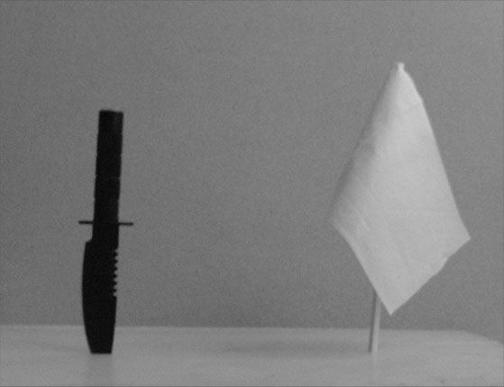
No special techniques, no lighting...
No professional camera, no experienced photographer...
No good shot, calculations of exposure...
Yet the moral is clear, the meaning is enough...
Two opposites on this planet...
Statistics
Place: 280 out of 286 Avg (all users): 3.4867 Avg (commenters): 3.0800 Avg (participants): 3.2720 Avg (non-participants): 3.6400 Views since voting: 943 Votes: 300 Comments: 25 Favorites: 0
I know the background contrast brings out the message of your photo, but I think I'd like a little more differentation between background and foreground would help.
Cool idea for a picture, I like the idea alot. I think you'll get burned a bit for the noise, looks like you took the picture in very very low lighting. Nice job though...
Black vs. white and war vs. peace - contrasting tones and symbols working together - that's good. Image appears very grainy - I think the contrast apparent in your background detracts from the contrast you've established between your two objects.
The table edge on the right is distracting, and the image is very grainy. Might have also done better from a more interesting angle than head-on. Maybe contrasting the knife against the flag.
This picture is poorly lit, out of focus, dully composed. What's the white thing -- a surrender flag? Are they stuck to some sort of table? Why? There's no dynamic tension in the picture.
Good choice of opposites. There is too much negative space, its out of focus, and there really doesn't seem to be any detail in the knife. I would like to see you rework this idea with a little more creativity. 3
My suggestion for imporvement here would be less of a staged look. This is just a boring set up and needs something else to help it connect. A hat, tank, better background, tree branch, army men...etc. Maybe the knife on the flag....? The noise is distracting from the shot. ?More light and a lower ISO for less noise. Best of luck in the challenge.
This photograph is so poorly done I can't imagine why you ever submitted it to the contest. Not only is it out of focus and grainy, but it is so uninspiring as to be brain-deadening. A knife near a white flag... The lighting is terrible, there is virtually no contrast in this photo, and the composition is so ill-conceived as to be mind-boggling. There is nothing interesting about this photograph whatsoever. Please don't waste our time posting photos like this.
Is this taken from a cell phone camera? The grain and noise is very extreme. If it's a regular digital, you may want to reduce the ISO to 80 or 100 at the very least. This also doesn't look in focus.







 Add photograph to your favorites
 Add photographer to your favorites


