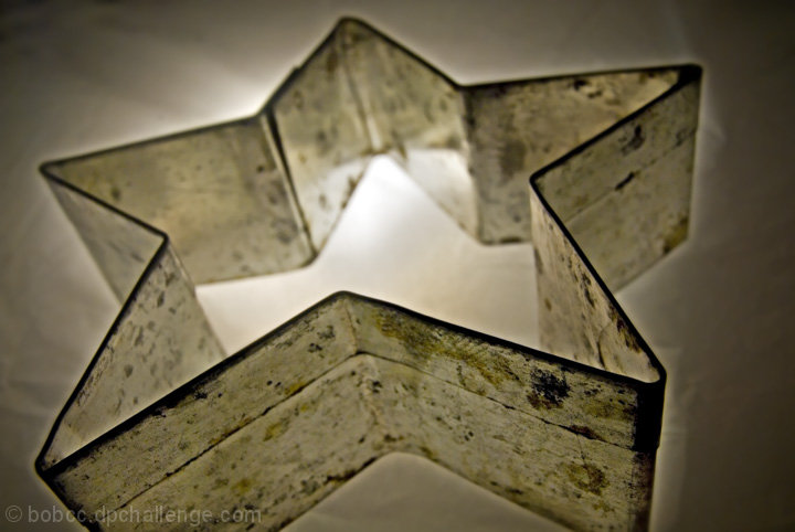
the crinkles in the sheet that is underneath the cutter is a little distracting to the main subject, but the contract is nice, i like it hard. (thats what she said) oh well, never mind.
This is a nice idea, but there are a couple of aspects that take away from it. The brightest area is out of focus and that's where my attention's drawn to, meaning my initial reaction to the shot isn't great, it might have been better if you either changed the focal point or changed where the light was coming through.
The other thing is that there's a lot of texture here, but the colours aren't particularly attractive, perhaps a high contrast B&W would have made it much better, just an idea.
Yes, it's a star, but the setup could have been much better. Clean up the cookie cutter, get rid of the wrinkles on the sheet or whatever it is. I'm undecided about whether it would look better all in focus or with the shallow front DOF you have. I do like the bright light behind it, but think it would be improved if the light was more in the center of it. You cropped a bit too close on the bottom. And the overall lighting needs to be better.







 Add photograph to your favorites
 Add photographer to your favorites


 Photographer found comment helpful.


