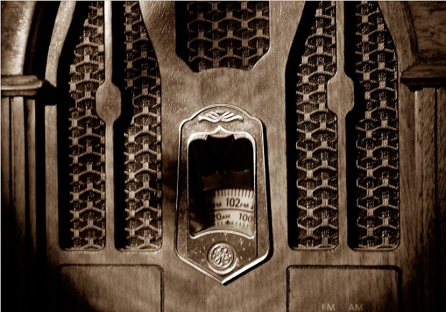
Cropped a bit of excess background out. Adjusted levels and contrast. Converted to grayscale via lab color. Applied a duotone and upped the saturation a tad. The radio was given to me by my Dad, it's pretty old and very dear to me. I'm not sure how it will do in the challenge but I'm pleased with how it came out. :)
Statistics
Place: 140 out of 187 Avg (all users): 4.8629 Avg (commenters): 4.8571 Avg (participants): 4.7714 Avg (non-participants): 5.0000 Views since voting: 1181 Votes: 175 Comments: 25 Favorites: 1 (view)
Creative and interesting in a good way selection. may have been better with a background. suggest positioning this subject against a modern techno-backdrop as a contrast (old v. new) and work on dof & focus. i don't like the sepia on this subject. the round black corners distract. I'd be interested in this photo for my gallery if you take my suggestion especially finding a contrasting background and leaving the radio in b/w against a color background. a visibly steaming cup of coffee (or any liquid prucing steam) positioned adjacent to the radio would be a perfect touch and would fit what I am looking for to purchase. contact me if interest. CMKStudio
The black spots in the bottom corners is really distracting. Were you looking through a hole or something? Perhaps a tighter crop or a different angle would help. There's also a shadow running diagonal down the photo from the center top to the mid left. I like the oclor, but the contrast & clarity could be higher.
i don't want to step on photographic intentions - but i don't see anything in sharp focus - may i suggest a clearer focul point? preferably sharper focus on the 'objects' in the middle of the frame.
This is a very interesting image, and I like the overall sharpness you've achieved. The vignetting in the lower left and right corners is bothersome, though.
I think that the focus should have been sharpest on the numbers rather than on a plane slightly in front of the radio...or you can try different depth of fields...





 Add photograph to your favorites
 Add photographer to your favorites


 Photographer found comment helpful.


