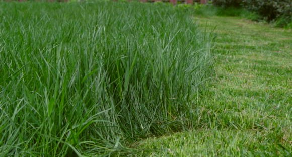
Great color and textures - the difference between the two is really fun - I like that it's not a regular line between the two. The contrast could be bumped a little and perhaps a little closer framing to create a stronger composition.
Okay idea - but I think you've got uncut grass vs. cut grass. Tonal contrast between the two is weak and the framing is off. Whatever the "red" things are in the background - they serve to distract the reader - especially because red and green are opposite hues.







 Add photograph to your favorites
 Add photographer to your favorites


 Photographer found comment helpful.


