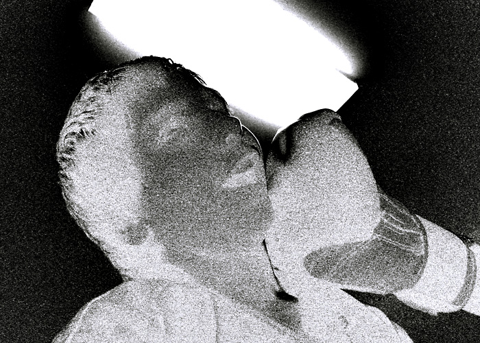
Isaac and Sensei Mark staged this for me after class.
I knew under the lighting conditions I'd have to use the highest ISO setting and that it would be noisy, so I planned on making the "grain" part of the composition, and to go with a B&W or toned look.
-Handheld, Tv mode
-Channel Mixer in monochrome mode; Red +130, Green +40, Blue -40
-RGB Curve to partially invert: 0=0, 52=100, 82=76, 100=0
-Blue/Yellow Curve to tone: 6=0, 77=78, 100=100
-Resize
-USM at 12%/48 dia/TH 0
-USM at 66%/0.6 dia/TH = 5
-Crop a tiny bit (mostly from the top) to save file size
-SaveAs JPEG at quality 8/10 = 199KB
[Dec. 17th, 2008 01:35:14 PM]
Resized original: [thumb]748106[/thumb]
Statistics
Place: 86 out of 87 Avg (all users): 3.5987 Avg (commenters): 3.5455 Avg (participants): 3.3864 Avg (non-participants): 3.6852 Views since voting: 1146 Views during voting: 289 Votes: 152 Comments: 16 Favorites: 0
ah man, i see you may be new to this? a few pointers:
1. way way too much grain, its super distracting
2. the picure looks like a snapshot of friends
3. the use of turning the image into a negative,
really makes this image negative in my eyes, i dont like it.
4. the overhead light is very distracting.
Hope this helped, and keep trying!
LOL Anyone else find this kind of ironic figuring he's on site council?
:P
deliciously so....
ahahahahaha! boy, do i know how to spot em! baha, this is too funny
ah man, i see you may be new to this? a few pointers:
1. way way too much grain, its super distracting
2. the picure looks like a snapshot of friends
3. the use of turning the image into a negative,
really makes this image negative in my eyes, i dont like it.
4. the overhead light is very distracting.
Hope this helped, and keep trying!
LOL Anyone else find this kind of ironic figuring he's on site council?
ah man, i see you may be new to this? a few pointers:
1. way way too much grain, its super distracting
2. the picure looks like a snapshot of friends
3. the use of turning the image into a negative,
really makes this image negative in my eyes, i dont like it.
4. the overhead light is very distracting.
Hope this helped, and keep trying!
LOL Anyone else find this kind of ironic figuring he's on site council?
ah man, i see you may be new to this? a few pointers:
1. way way too much grain, its super distracting
2. the picure looks like a snapshot of friends
3. the use of turning the image into a negative,
really makes this image negative in my eyes, i dont like it.
4. the overhead light is very distracting.
the use of grain, high contrast, and backlighting to give an almost etching like feel works pretty well - i am just not completely convinced on the light positioning in the image
I think you went to some effort taking this picture, but to my tastes it's too over processed, and I don't really like the effects you've presented. I think this would have been much better in its natural state i.e. without all the processing.







 Add photograph to your favorites
 Add photographer to your favorites

 Photographer found comment helpful.


